This is pretty huge for downtown Vancouver.
After months of peeking over the construction fence, I - like hordes of others - have finally found myself inside the new convention centre as part of its two day public opening. Both days the centre is open to everyone from 10-4 with performances and events scheduled during that time.
Boasting many environmentally responsible strategies, it was designed by Seattle's LMN Architects with Vancouver's Musson Cattell Mackey Partnership and DA Architects. This 338,000SF $ 883 million convention centre is in process to be certified as a LEED Gold project. Among it many "green" features are:
- six acre green roof - Canada's largest green roof
- black water treatment & recycling
- grey water reuse
- artificial reef /marine habitat to mitigate effect of new underwater foundations
- local material usage
- cooling and heating system that utilizes the water of the inlet
- natural ventilation
- energy-efficient lighting
- comprehensive recycling
- powered by "green power" - certified as electricity that comes from renewable/sustainable sources
This is best aided by the wall panels made of stacked hemlock boards; apparently these were assembled by a robot named Victoris in Saanich. Thus clad, the large masses have the warmth and richness that complement their scale; the bold massing is almost satisfying - in few Canadian buildings one can find such frank boldness - save for minutia of signs, screens, and other miscellany that insist breaking it up with busyness.
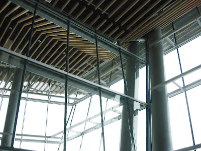
The other finishes in the main areas are less successful. The glulam boards that create a seamless ceiling screen, which hides various services conduits and ducts painted black, are quite successful in reflecting a flow of circulation and a flow of roof planes above. However, these seem to exist for their own sake - as if the reflected ceiling plan drawing was made with great care and conviction but not in harmony with the other aspects of the spaces and masses. It is hard to tell what is happening with the carpet altogether. The aluminum screens fit in the way these do in most contemporary buildings - an obvious choice within the palette of other metals - those of curtainwall, of structure's cladding, of hardware, etc.
The finishes switch abruptly at the basement level altogether in favour of an entirely different palette; the exhibition space lacks connection with the building above altogether (but the concrete floor is just gorgeous! ).
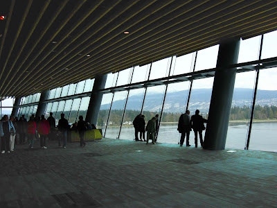
The building has many overlooks, terraces, and balconies, providing ample opportunities to enjoy spectacular views of the North Shore. Green roof - alas inaccessible - often provides interior views that are quite striking.
Although it is not seamless, this building has some fantastic moments!
Here my photos of the interior:
The official website for VCEC has very lovely photos - unlike the ones above - check them out. In a future post, I will add exterior photos (once I take them).
Update: Gordon Price delivers a wonderful review of this building over at Price Tags.


