Wednesday, July 30, 2008
Serrenia
Serrenia,Egypt..by Foster&Partners ..
more information..
and here ..
official site
see it at google maps
Monday, July 28, 2008
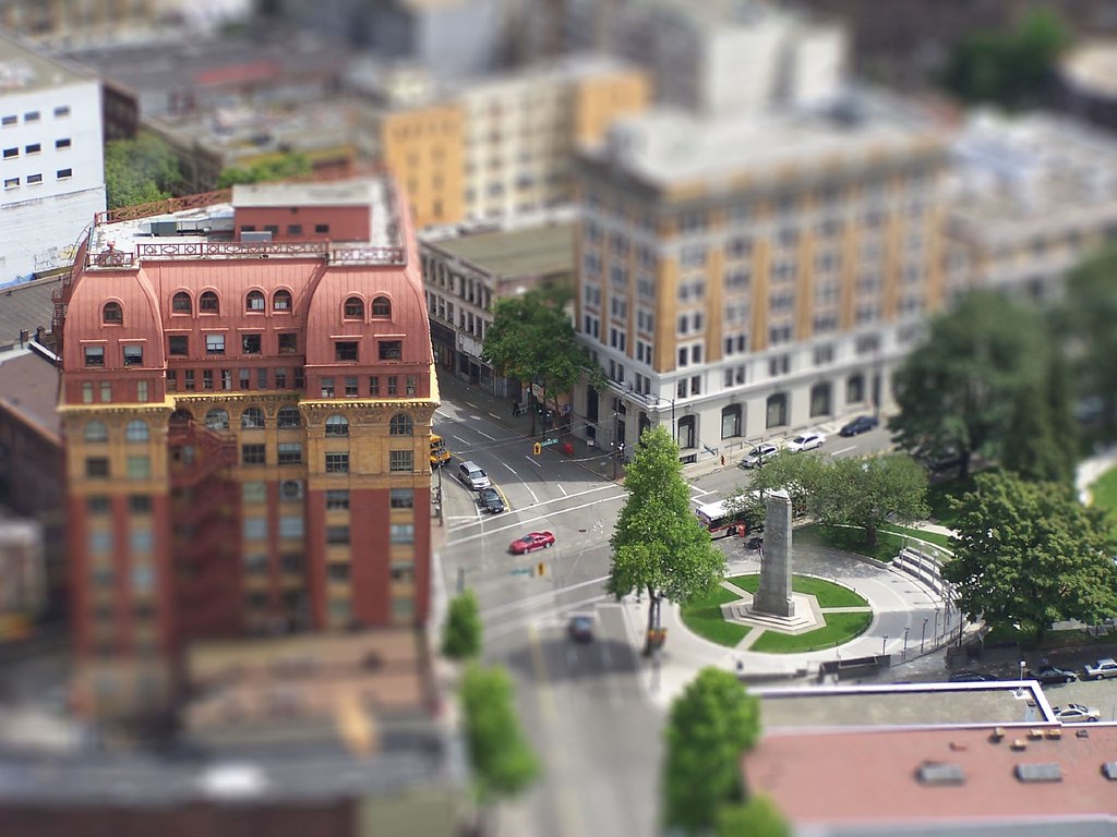
Can't get tired of (fake) tilt-shift images - Vancouver edition
both by Captain Krispy Kreme
find more here.
And here is my stab at it - not too bad for a total of one minute's work:
Sunday, July 27, 2008
Thursday, July 24, 2008
Erickson's for sale - yet again
No, no, this is not about the man, but about one of his works. In 1979, Arthur Erickson designed a veritable suburban dream - Montiverdi Estates, an entire cul-de-sac of Keith Road in West Vancouver. I found out about the project, accidentally, during a drive-by...
Interestingly, Russel Hollingsworth's own mini subdivision at Meadfeild Road has gone up just a few trees away from Erickson's. And now you can buy into either as both Hollingsworth's and Erickson's homes are up for grabs.
Erickson's homes at Monteverdi appear on the market frequently enough. Right now for sale are two homes, one of which is 5338 Montiverdi Place (I don't mean to plug the listing, but here it is) for a cool $1,298, 500. Courtesy of the realtor we get to see some of the interior:
The other one is at 5361 Montiverdi Place - $1,195,000. Unfortunately the images are terrible. Another of the community's homes - 5310 Montiverdi Place - sold recently as well (for $1, 495,000 - if anyone wants to know). More realtor pics:
Another one, 5352 Montiverdi Place, sold in May for $1,450,000. But there is only one picture of it from the Globe and Mail article about the sale:
Aside from wackiness that is the West Vancouver real estate market, I was quite surprised with the interiors of the homes. Granted - many of them might have changed substantially, but the interiors do not seem to live up to the rather lovely exterior - wonderfully massed and sites and beautifully layered.
By the way, some images of Russel Hollingsworth's Headland Park project can be seen here - these sell at about twice the price of Erickson's homes.
Oslo Opera House
Wednesday, July 23, 2008
Digital Beijing Building
Digital Beijing Building,China..designed by Studio Pei-Zhu ..
more information..
and here ..
flickr
see it at google maps
Tuesday, July 22, 2008
Mastar City
Mastar City,Abu Dhabi,UAE..designed by Norman Foster ..
here more information..
here also..
official page
flickr
see it at google maps
Monday, July 21, 2008
Serpentine Gallery Pavilion 2008
Serpentine Gallery Pavilion 2008..designed by Frank Gehry ..
more information..
here..
official page
flickr
see it at google maps
Saturday, July 19, 2008
Friday, July 18, 2008
London City Hall
London City Hall..designed by Norman Foster ..
more information..
and here ..
official web site
flickr
see it at google maps
Tuesday, July 15, 2008
Baker / Forrest House by Ron Thom and Dick Mann
This 1962 Ron Thom house was the final and the longest stop on the West Coast Modern Homes tour this past Saturday. Its owners have spent a lot of effort to renovate it and also graciously lent it for a reception held by the museum. In a time when many West Vancouver modern treasures have been replaced by McMansions or giant gaping holes awaiting McMansions, it is fantastic that its latest owners chose to preserve it and to share this cultural artifact with others.
As they are still renovating it, some of the characteristic elements are not yet in place. Again the pictures are not great, but my visit was!
the entry
glazed entry corner
elevation that faces the view-click on image to enlarge.
the view - definitely worth enlarging - it is truly incredible!
view from the living room.
roof planes colliding in the living room.
another view of the south elevation.
living room.
fireplace corner in the living room.
fireplace nook.
Detail of partitions meeting the ceiling and of hallway light fixtures.
The site determines much about this house - its massing and even the angles of the house's roof planes (same angle as the site's slope). The roofs appear to hover above the landscape as the vertical elements that support them recede visually, as large steel beams cantilever the roofs out. This is furthered by contrasting the lightness of the glazing frames with the heavy concrete base. The drama of the scheme is in the roofs and was economical to achieve by simplifying the rest - the layout, the finishes, etc.
Inside the designers overlap spaces, creating complex spatial composition and sequencing that Thom was always spectacular with. The fireplace, too, manifests prominently - Thom, like Wright, always seems to have placed a great importance on the hearth. Here it is more streamlined than such others of his that I have seen, and more moving for it.
The house got a Massey Medal (a GG of earlier years) in 1964. To see the house as it was then, photographed by Selwyn Pullan, click here.
I will try to post more pictures from the tour and from my other recent walkabouts soon.
Also - keep checking the map to the right, not only does it include this post's subject, but I am constantly updating it!
Monday, July 14, 2008
English Bay Bistro by Acton Ostry
Having missed the public consultation meetings for the proposed English Bay Bistro designed by Acton Ostry Architects, I dug around for a bit and found a few images, although these are not of the best quality. Below are schematic design renderings and plans:
To be located next to the bathhouse, it will be a two level building with indoor and outdoor seating and a take-out kiosk. The indoor space will total around 2500 sf, while the patio will make up another thousand. This $5-6 million dollar project has been somewhat controversial as local residents and avid beach goers fear that it will be too expensive and will set a precedent for commercialization of the beaches. The park board , which will receive 6.5% of the sales, tried to assure the worried that the venue will be more of a Cactus Club or Earls-type restaurant. That is not really affordable - not to me - but I digress.
I have been looking for images of the proposed design as I imagined that Acton Ostry will create something utterly special considering the location and the public focus that has been on the project, and their own track record of creating thoughtful buildings. However, I am not sure I see it yet. Judge for yourselves:
Lower level. Btw: these potlights are, what, 14" across? what an oddity!
Upper level.
The renderings suggest that coloured glazing is the predominant element; yet the plans and massing suggest something more subtle might be ahead. We shall see.
lower level plan.
upper level plan.
roof level plan.
In an article about the bistro in the Vancouver Province, this easily sums up my own hopes:
Acton Ostry are also working on Harbour Green Restaurant for the same client, the Park Board, beside the future Vancouver Trade and Convention Centre (and it looks, well, not dissimilar).
To be located next to the bathhouse, it will be a two level building with indoor and outdoor seating and a take-out kiosk. The indoor space will total around 2500 sf, while the patio will make up another thousand. This $5-6 million dollar project has been somewhat controversial as local residents and avid beach goers fear that it will be too expensive and will set a precedent for commercialization of the beaches. The park board , which will receive 6.5% of the sales, tried to assure the worried that the venue will be more of a Cactus Club or Earls-type restaurant. That is not really affordable - not to me - but I digress.
I have been looking for images of the proposed design as I imagined that Acton Ostry will create something utterly special considering the location and the public focus that has been on the project, and their own track record of creating thoughtful buildings. However, I am not sure I see it yet. Judge for yourselves:
Lower level. Btw: these potlights are, what, 14" across? what an oddity!
Upper level.
The renderings suggest that coloured glazing is the predominant element; yet the plans and massing suggest something more subtle might be ahead. We shall see.
lower level plan.
upper level plan.
roof level plan.
In an article about the bistro in the Vancouver Province, this easily sums up my own hopes:
Vancouver's Jeff Miller said the restaurant's success will be a matter of execution, with a profound impact for one ofAt the very earliest, the bistro will open in summer of 2010.
Vancouver's most-visited locales.
"If it's done the right way, it could be nice," said Miller.
"If it's done the wrong way, it could be an eyesore and ruin the beach.
Acton Ostry are also working on Harbour Green Restaurant for the same client, the Park Board, beside the future Vancouver Trade and Convention Centre (and it looks, well, not dissimilar).
Tuesday, July 8, 2008
The other side of Dockside
Last week I beheld the back elevation of Henriquez's Dockside building in all its entire glory - a rather new occurrence. Built on a narrow lot, this Westbank mixed-use project has been exposed by recent demolition of two older buildings on West Pender. Probably not for long. For a long time I saw this building everyday - so for me this is kind of exciting, actually. And so here is the record of its exposure:
By the way, apparently this project was built in 2002 for $14 million. That is the price of - what? - three of the grade level units in it now, if even that many!
BTW # 2: it won 2003 Lieutenant-Governor Award of Excellence in Architecture.
Dockside is at 1478 West Hastings, and if anyone wants a map of Henriquez projects in downtown they provide on their website (I thought that was actually pretty useful).
Thursday, July 3, 2008
It's a flower, it's a frog, it's a new VanDusen project !
Although I find the iconography a bit confusing, I can not help but be really *very* excited about the new development in VanDusen Gardens . Two buildings - an admin and education building and a special events pavilion - are to be built as part of this $31 million project which aims not to only update the current facilities but to - as the renderings easily attest - draw a new crowd in, to bring in younger faces as well with its flashy new outfit.
And flashy it is, looking like a flower, a butterfly, ... well, something living anyway. The pictures created by Busby are seductive (by the way if you are at all feeling seduced / generous, you can find out how to support this project here), all joyful colours and sensual shapes! Enjoy:
Seems that these images are only of the larger building and, hopefully, we'll be able to see the pavilion images soon, but as it is part of Phase 2 there might be a bit of a wait.
According to Van Dusen website, native orchid is the inspiration for the striking form:
Recent Press:
Journal of Commerce January 2008
Vancouver Courier May 2008
Vancouver Sun June 2008
P.S. HBBH: way to start a trend - is that a rammed earth wall I spy?
Subscribe to:
Posts (Atom)